Kamala Harris unveiled her campaign logo hours after Biden’s exit. Political graphic designers deconstruct the meaning behind it
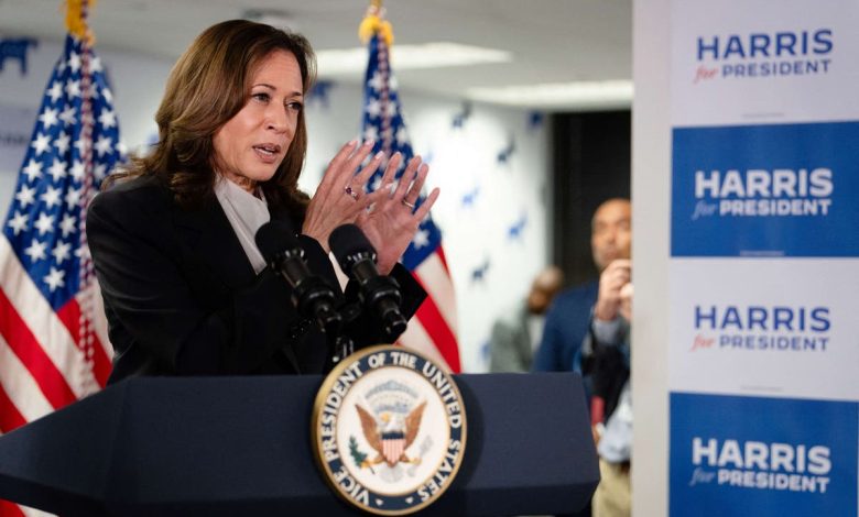
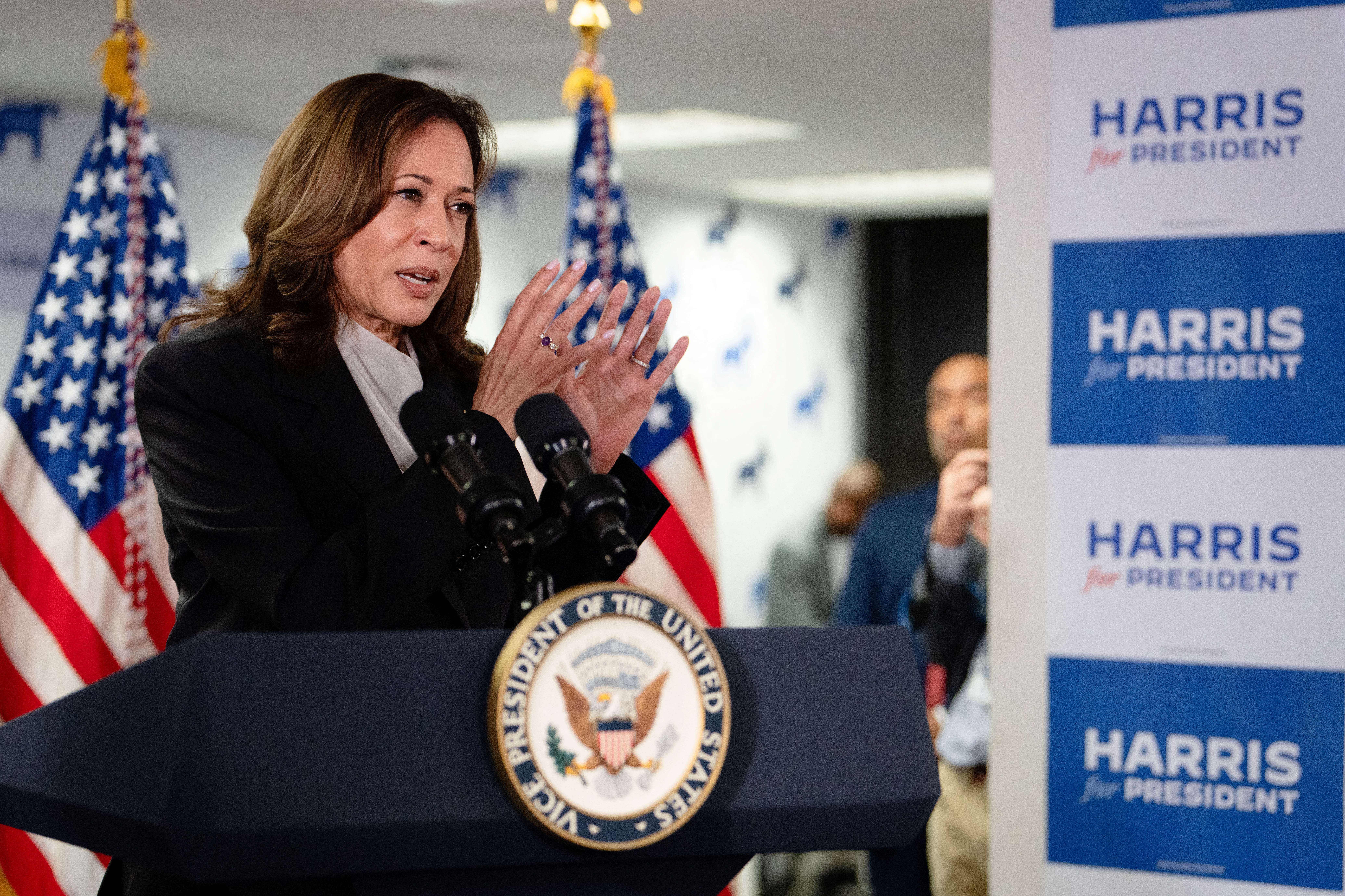
At Kamala Harris’ first event as a 2024 presidential candidate on Monday, the signs bearing the “Harris for President” logo were so fresh the Advance team had to run the still-wet placards straight from the printers to the Wilmington campaign headquarters.
The design was nearly as new. Less than an hour after Joe Biden announced his departure from the presidential race on Sunday afternoon, the redesign began with a call out on Slack to see which staff were available.

“The Harris for President creative and web teams sprang into action, rebranded the entire campaign overnight, and launched a new website in just 26 hours,” Harris for President Creative Director Kate Conway told The Independent. “There’s really no overselling how difficult a task that is.”
The creative team — mostly made up of women and led by women — designed six different new logo options. They narrowed it down to two, and then shared it with Harris’ team for final sign off.
The new logo sports the same Americana red, white, and blue color scheme and Decimal typeface featured in the Biden-Harris campaign, linking it visually to the brand identity and the historical record of the Biden presidency.
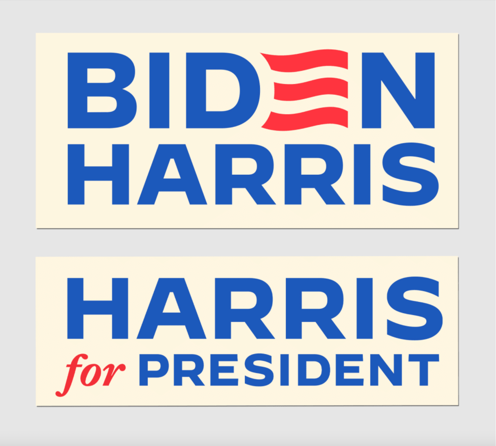
But it’s not totally identical: the Biden logo made the “E” in his surname reminicest of the stripes of the American flag. The Harris campaign instead highlighted the “for” in her new slogan with red, meaning that the eyes initially read the logo as “Harris President,” as if declaring it so.
When asked for their honest review, fellow designers tell The Independent that the Harris campaign is effectively using design cues in the new logo — even if it’s not the most thrilling.
“It’s not breaking any new design conventions,” Eric Krueger, founder of the multidisciplinary design studio Trees Cut Stars, told The Independent, calling the straightforward design “a fairly smart move.”
“She’s already the vice president. So it shows continuity in a lot of ways,” he continued. “This whole election has been chaotic, period, and I think the public has probably little appetite for wild changes.”
Megan Magray, a graphic designer who has worked with Democratic candidates including Tiffany Caban and Jabani Brisport, and other politicians, pointed out that the logo uses “Harris” instead of “Kamala” — a difference from Harris’ 2020 campaign when she used both her first and last name.
Using just her surname “is designed to speak to a conservative audience,” said Magray. Kamala is a common name in the Tamil community her mother originated from in India.
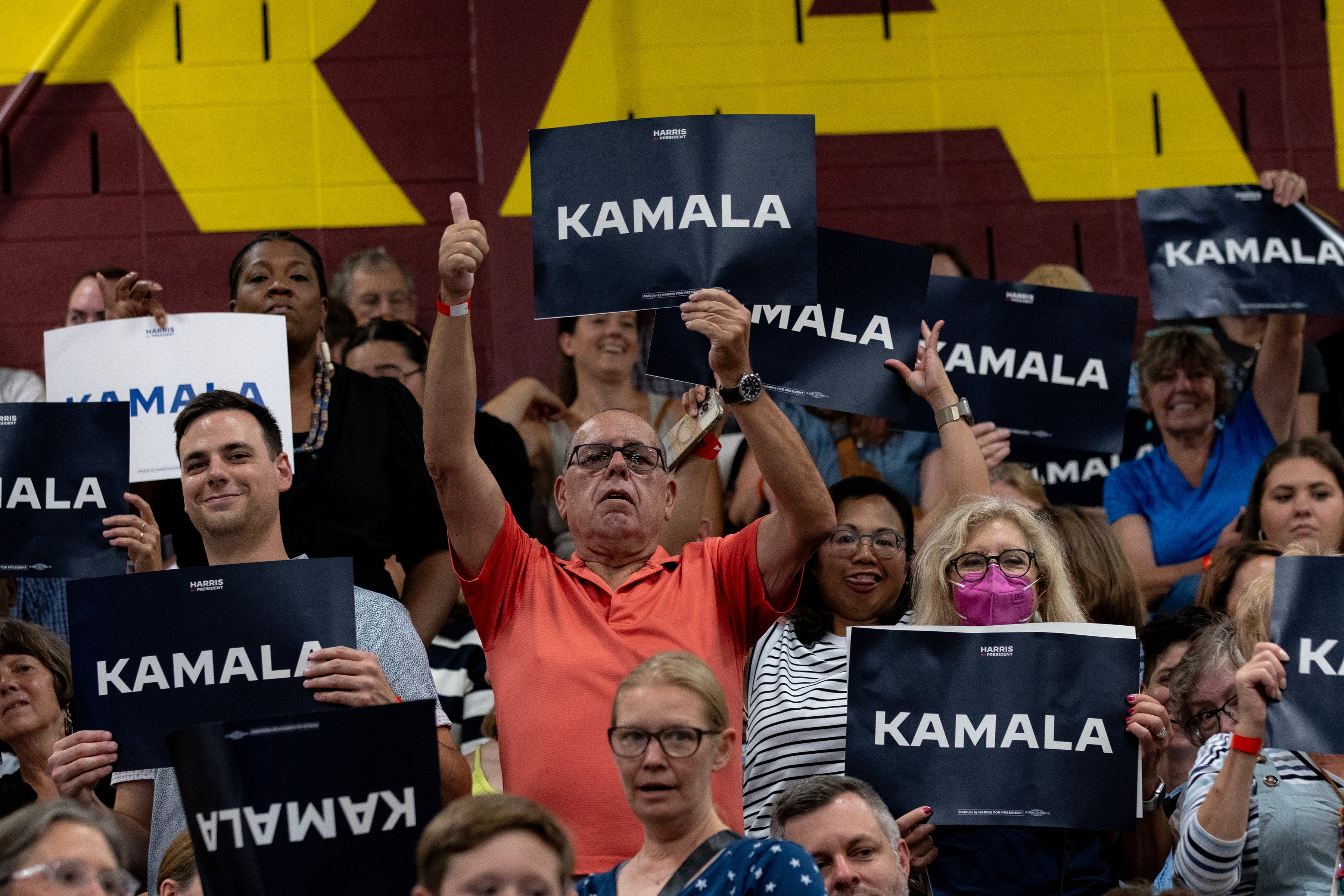
At her rally on Tuesday, posters reading simply “Kamala” also appeared in the crowd.
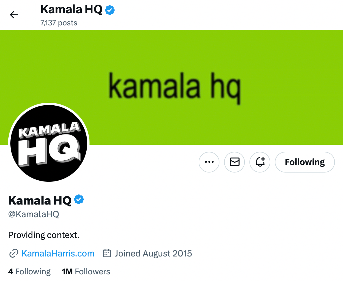
The official “Harris for President” logo differs noticably from her online presence, Magray says, where the Harris campaign has capitalized on coconut memes and Charli XCX’s recent endorsement.
“On the one hand, you have a very traditional identity deployed to appeal to voters who are craving a return to normalcy, people who just want a competent executive,” said Magray. “But online, the campaign is running a strategy of memeification, an aggressive digital effort to make Kamala a hip, fun candidate whose moral superiority is secured by the fact of her womanhood.”
In a nod to the Brat popstar, the campaign’s profile header on X recently changed to read “kamala hq” with a Brat-green color background.
“It’s a strategy that banks on a degree of naïveté among young voters, but that’s not to say it won’t be effective,” Magray said.
Harris is inheriting the legacy and burdens of Biden’s presidency. As Amanda Buindo, vice president of creative and marketing at Republican political consulting firm Ascent Strategic, said of the logo: “Nothing revolutionary is going on here regarding political design and branding.”
The short turnaround period may have resulted in some flaws in the logo’s technical execution. “There is a lack of proper tracking between the letters, and the edges of the letters fail to line up on both sides,” said Buido. She also questioned the efficacy of the logo’s resemblance to Biden’s. “Like his presidency, the Biden campaign was a failure; why would you want to imitate that?”
Following Biden’s withdrawal from the race, the Biden-Harris campaign website was redesigned to display “Show Your Support For Kamala Harris!” and features an image of Harris in the same purple background scheme seen in her 2020 presidential campaign. The campaign’s shopping page, named the Harris Victory Fund, displays signs, mugs, posters, and other merchandise sporting the new Harris logo.
“The brand exists everywhere from yard signs and rally placards to the website, our social channels, and our ads,” Conway said. “It was a massive effort.”
On X, formerly known as Twitter, campaign designer Ana Rice promoted the new Harris logo and wrote: “i’m one of four women leading the design team for the election campaign for the first Black woman presidential candidate. this is crazy.”
And as the VP jostling heats up, it may signal a change in design strategy again.
“At this juncture, the campaign is signaling that Kamala is a direct successor to Biden, just ‘unburdened by what has been,’” Magray said. “I don’t think we’ll see the campaign’s true brand strategy until Kamala picks a running mate. At that point we may see a visual pivot.”
Conway acknowledges that is already on the table. “We expect there will be continued evolution to the brand as she adds a running mate,” she said.


